The flow ended abruptly. You bought a vault, and the product had nothing left to say to you.
- Product designer, team of 1
- Symmetry, a DeFi platform for tokenised funds on Solana
- Three weeks, December 2023
- Research, user journey, IA, design system, high fidelity, prototype
- Won the hackathon
Symmetry lets people trade tokenised funds: collections of coins with a shared theme or strategy, managed either by a person or by rules. I was asked to redesign it. What it needed first was an audit.
The product was a straight line
I went through the existing flow and service structure looking for the obvious usability failures, interviewed heavy users, and read the complaints already sitting in the Discord and on Twitter. Then I benchmarked the experience against seven products, crypto exchanges on one side and retail investing apps on the other, because Symmetry is really both. The comparison produced the sentence the whole redesign hangs off: our experience was confusing, hard to navigate, and relied on the user already knowing what the product does.
- The flow ends abruptly and does not facilitate a flywheel effect.
- Creating a fund is clear and easy. Discovering one is confusing and cluttered.
- There is no help or tips for beginners. The design assumes prior knowledge.
- Fund creators need data to inform their decisions, like token performance and a vault performance simulator.
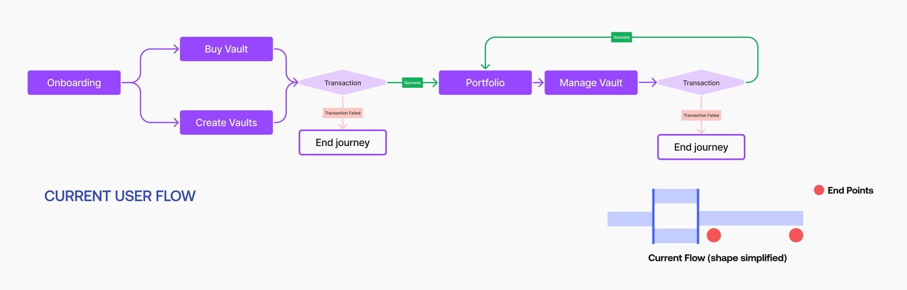
you can see it faster than you can say it. that is why the shape diagram exists.
Three appetites, one interface
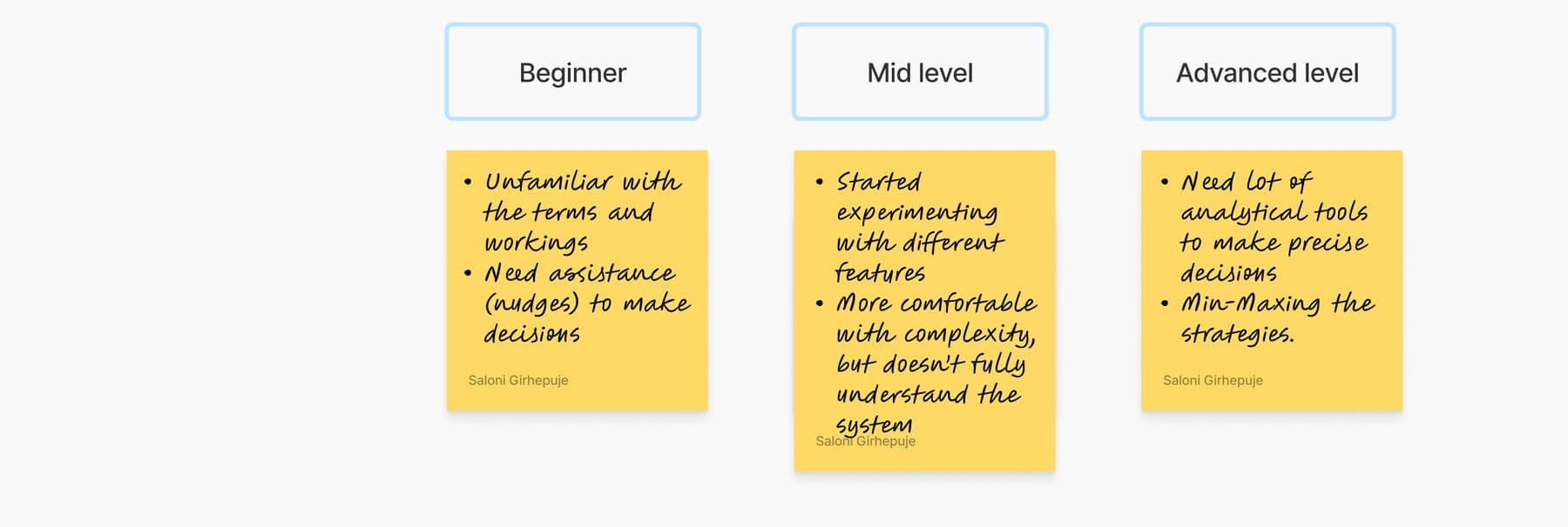
I tested a few ways of grouping users. The one that held up was where someone is in their trading journey, not who they are. A beginner is unfamiliar with the terms and needs a nudge to decide anything. A mid-level trader is experimenting with features without fully understanding the system. An advanced trader wants analytical tools and is min-maxing a strategy.
Exits turn a line into a loop
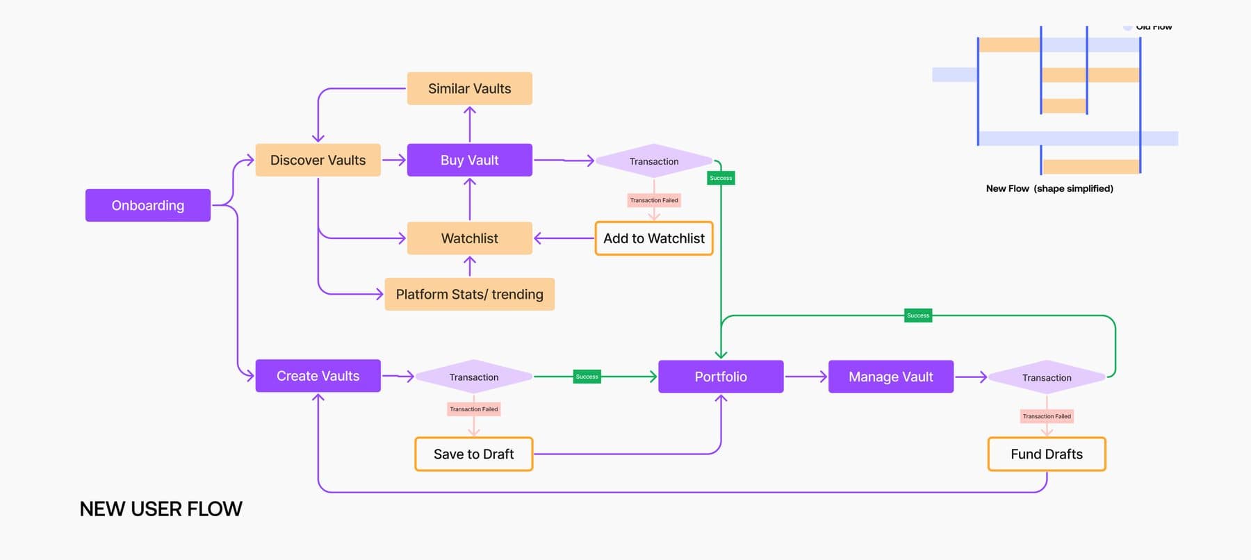
The fix for problem one was to give every point in the journey at least two ways onward instead of one. Watchlist, similar vaults, platform stats and trending, save to draft, fund drafts. Each addition is an exit that leads back into the product rather than out of it.
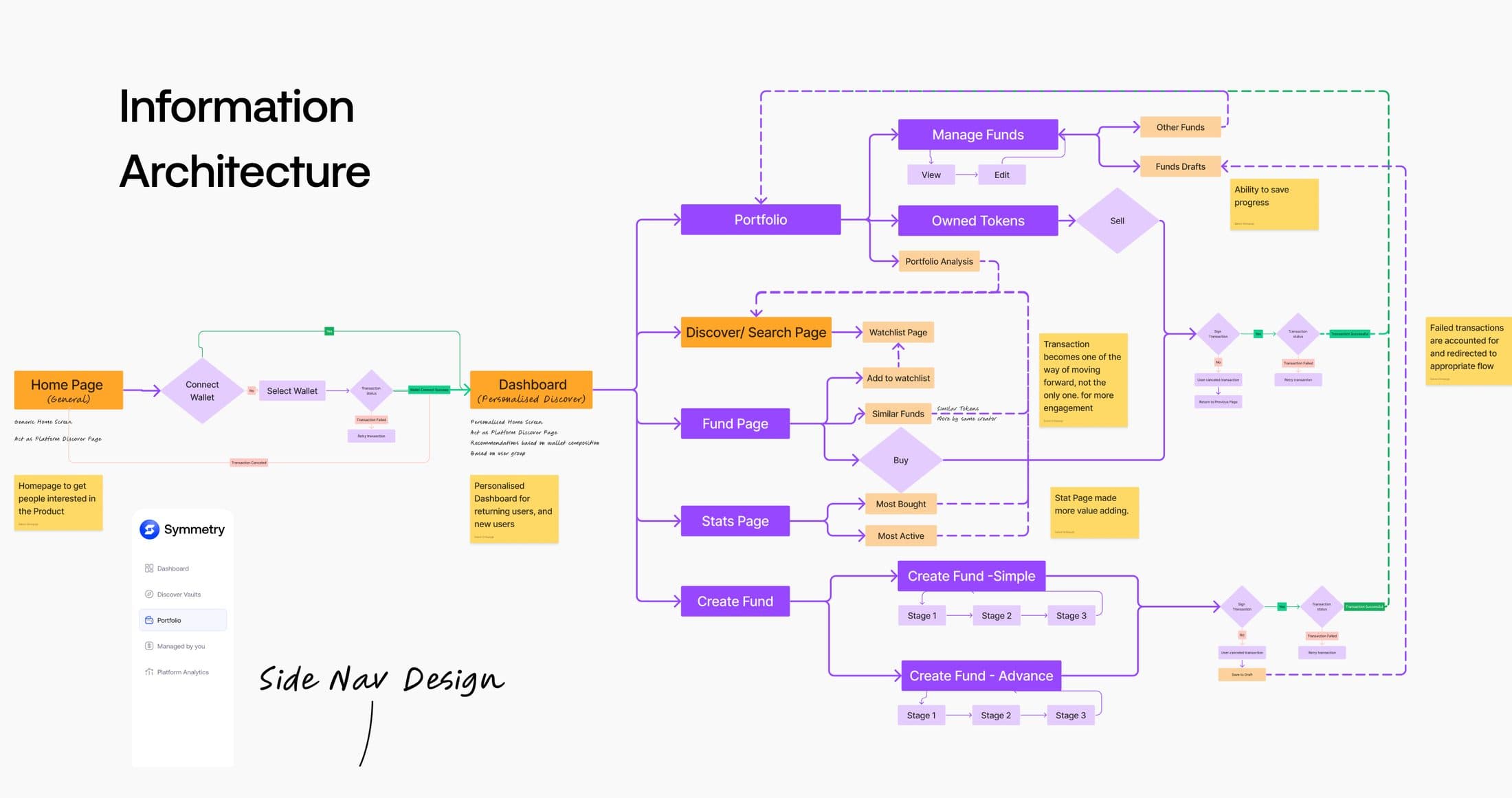
Restructuring the architecture also collapsed a duplication nobody had questioned: simple and advanced fund creation were two separate flows. They became one flow with two variations, by composition or by rules.
Where help is allowed to live
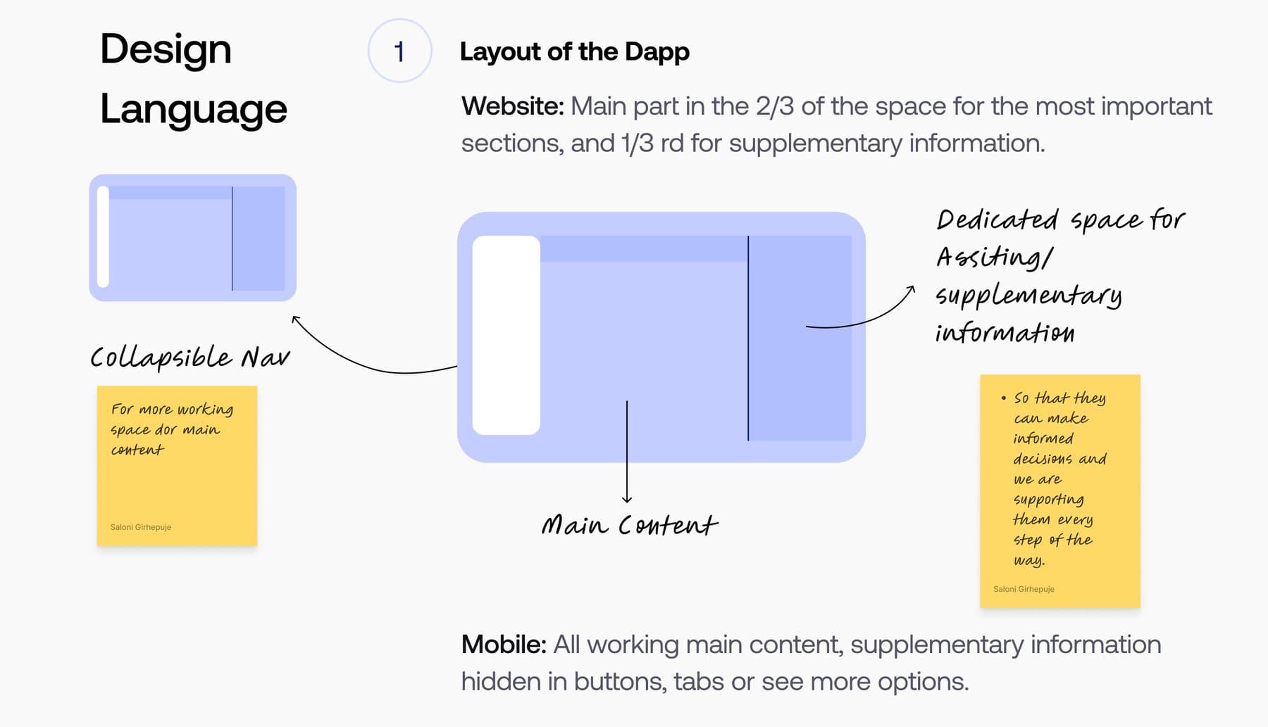
Two thirds of the screen carries the main content, one third is reserved for assisting information, and the nav collapses to give the work more room. That reserved third is the answer to the beginner problem: support gets a permanent home, so it never has to interrupt the task to be available. On mobile the rule inverts, the work stays and the help folds into tabs and see-more.
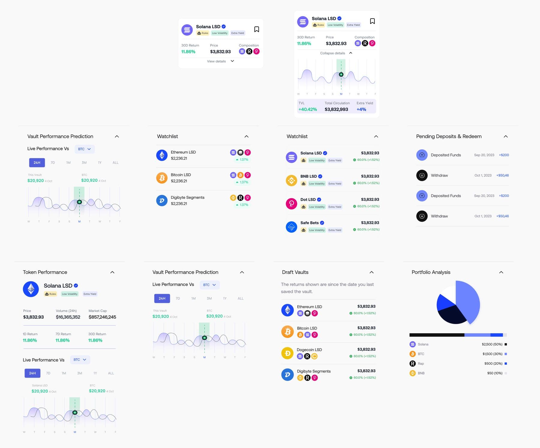
The second half of that answer is progressive disclosure. Every supplementary module opens. A first-timer reads a price and a return; the same card expands into composition, live performance against BTC, a performance prediction and a portfolio breakdown. One product, not a beginner mode and an expert mode.
What shipped
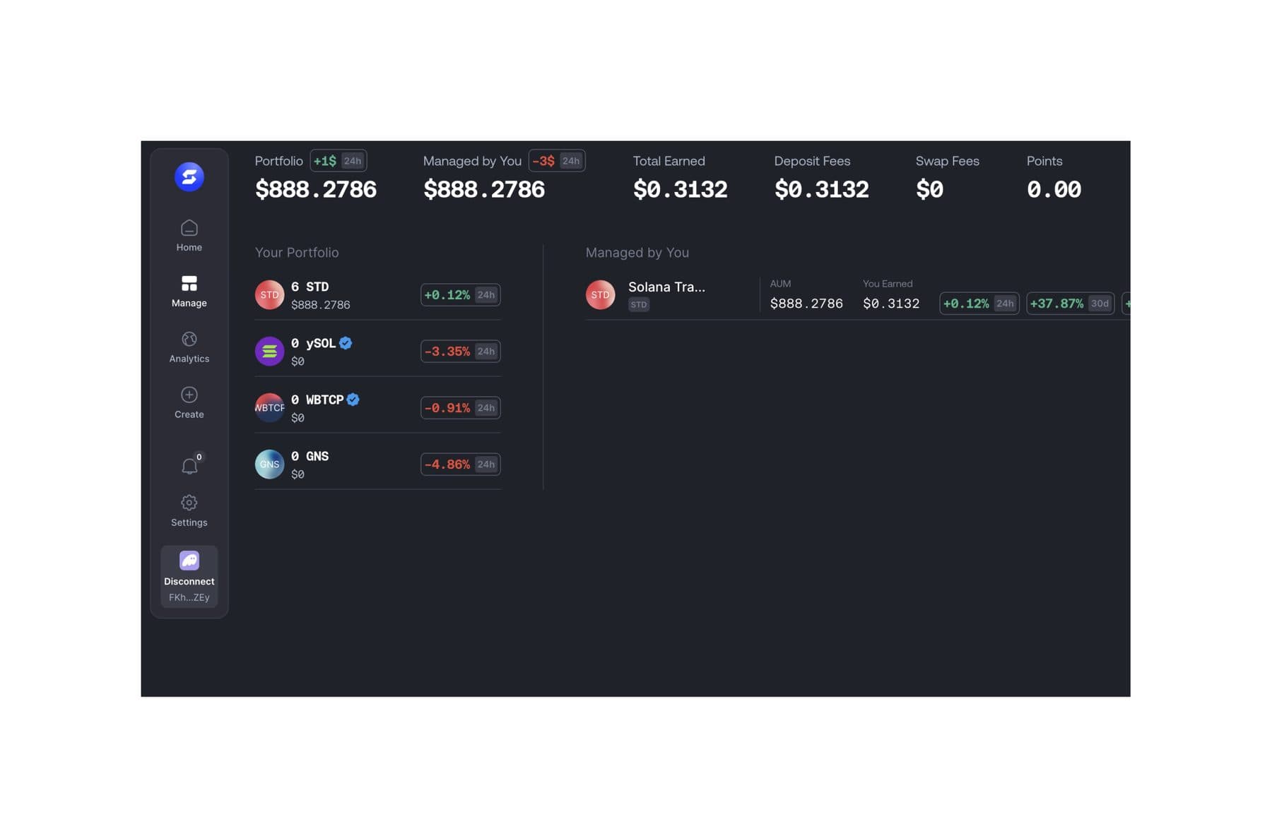
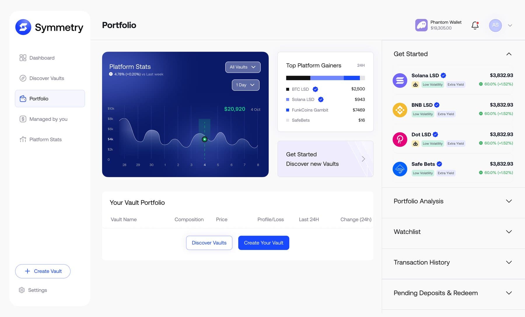
Fund creation answers problem four directly. Token performance sits beside the tokens while you pick them, live performance updates as you change the allocation, settings are grouped so they can be understood together, and a vault can be saved as a draft and deployed later, so you can build a strategy without paying to test it.
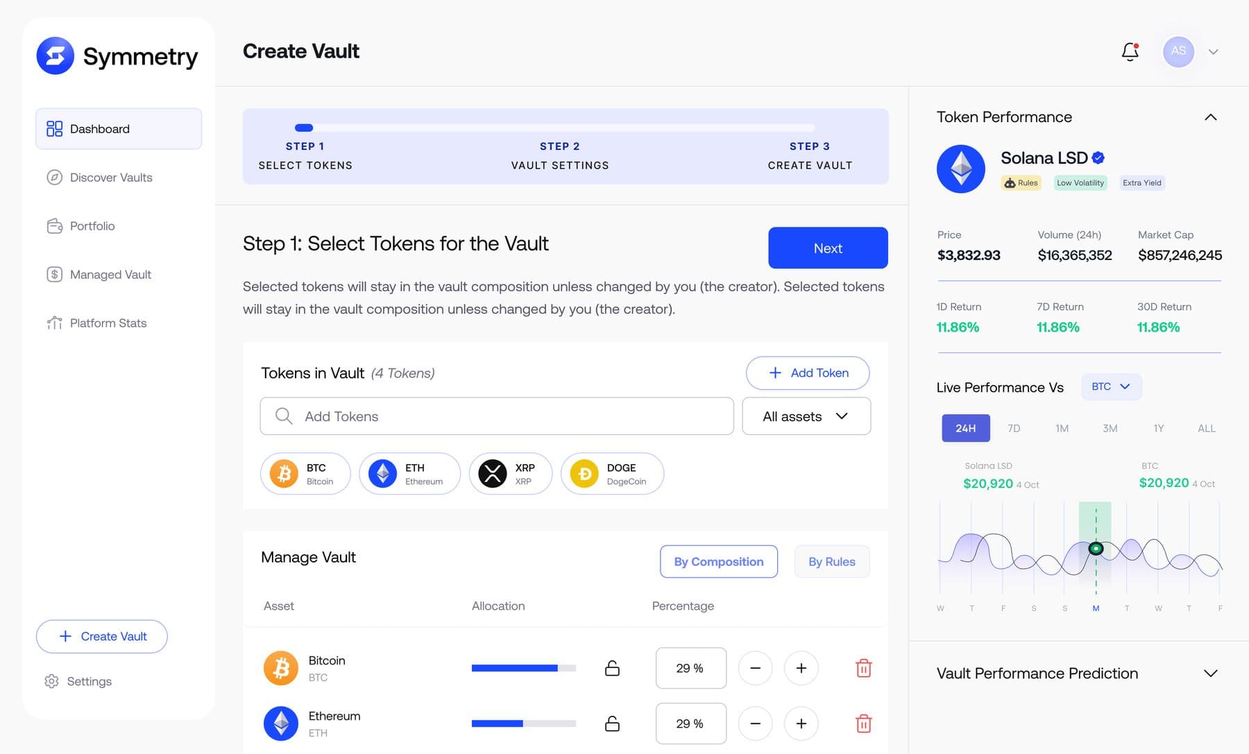
One component decision is worth pulling out because it cost the better-looking option. Allocating a percentage of a fund is a precision task, and a slider is clumsy at precision. So the slider stayed as a readout and lost the job of setting the number to a typed input with steppers.

i wanted to keep the slider. it just wasn’t the right tool for the number.
Tested, then handed over
The flow was tested in low fidelity first, so it could fail before the pixels existed. At the end I ran a usability study with five people from the target demographic at different levels of familiarity, on the prototype. It was well received and read as simple to use, and the complaints that did come back changed two things: the accessibility of the components, and which information appears at each step of the flow.
The honest limit is that it was never validated in production. The first concepts are only the beginning; every version of this was moved by research and peer feedback rather than by the idea I started with, and the real next step was a second round of studies to find out whether the pain points had actually gone.
What actually made the flow a flywheel?
Exits. In the old product each journey ran in a straight line and stopped: you bought a vault, or you created one, and that was the end. The new flow gives every point at least two ways onward, and the added ones (watchlist, similar vaults, trending, save to draft, fund drafts) all lead back into the product rather than out of it.
How do you serve a beginner and an advanced trader on one screen?
Structurally, not with a mode toggle. A third of the screen is reserved for assisting information so help never interrupts the task, and every supplementary module uses progressive disclosure, so a beginner reads a price and a return while an advanced trader opens the same card into composition, live performance and a performance prediction.
Three weeks or five days?
The project ran three weeks in December 2023, which is the number on the original case study. My active design time inside that window was about five days, team of one throughout.
Where is the rest of it?
The full 2023 case study is on Behance, linked at the top of this page: seven chapters, the double diamond, the competitor benchmark, the design system, the colour and type work, and every screen including manage vault, discover vaults and the buy and sell states. This page is the argument. That one is the record.